
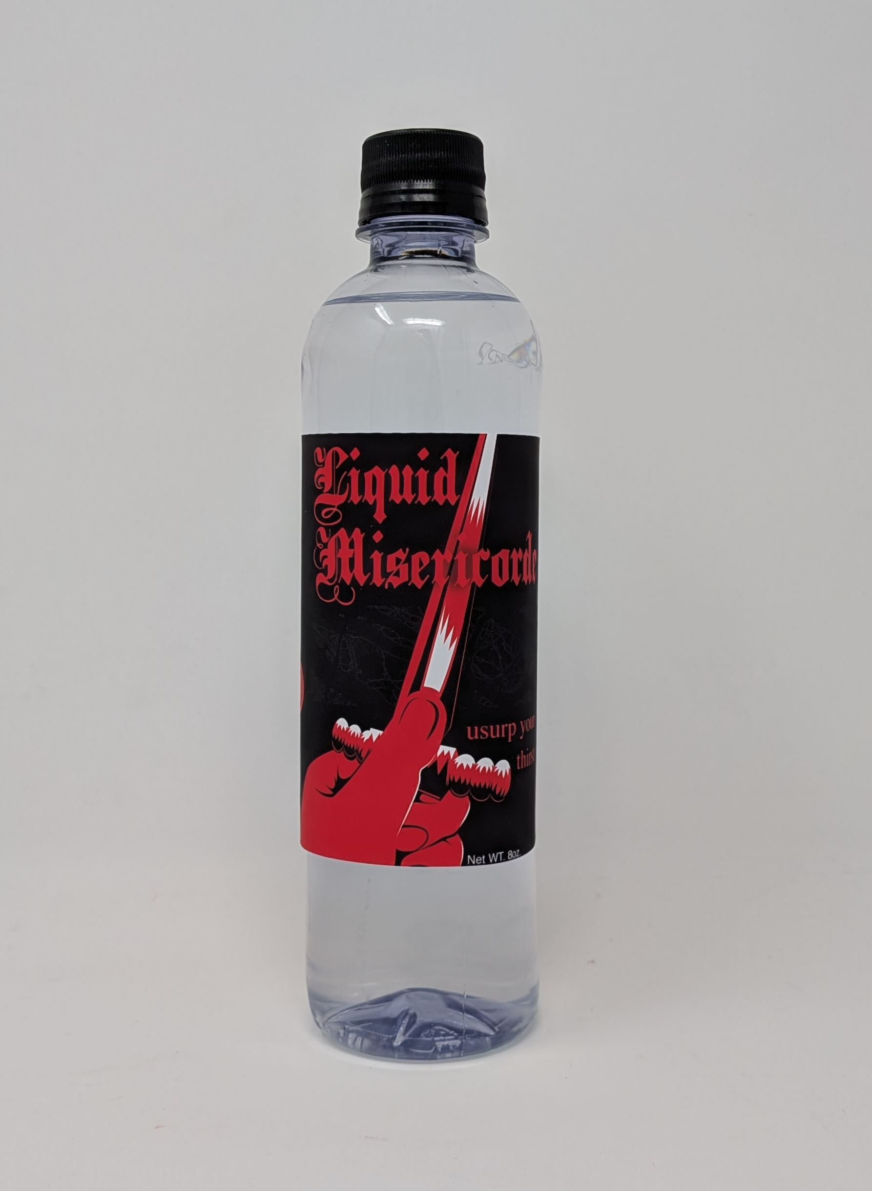
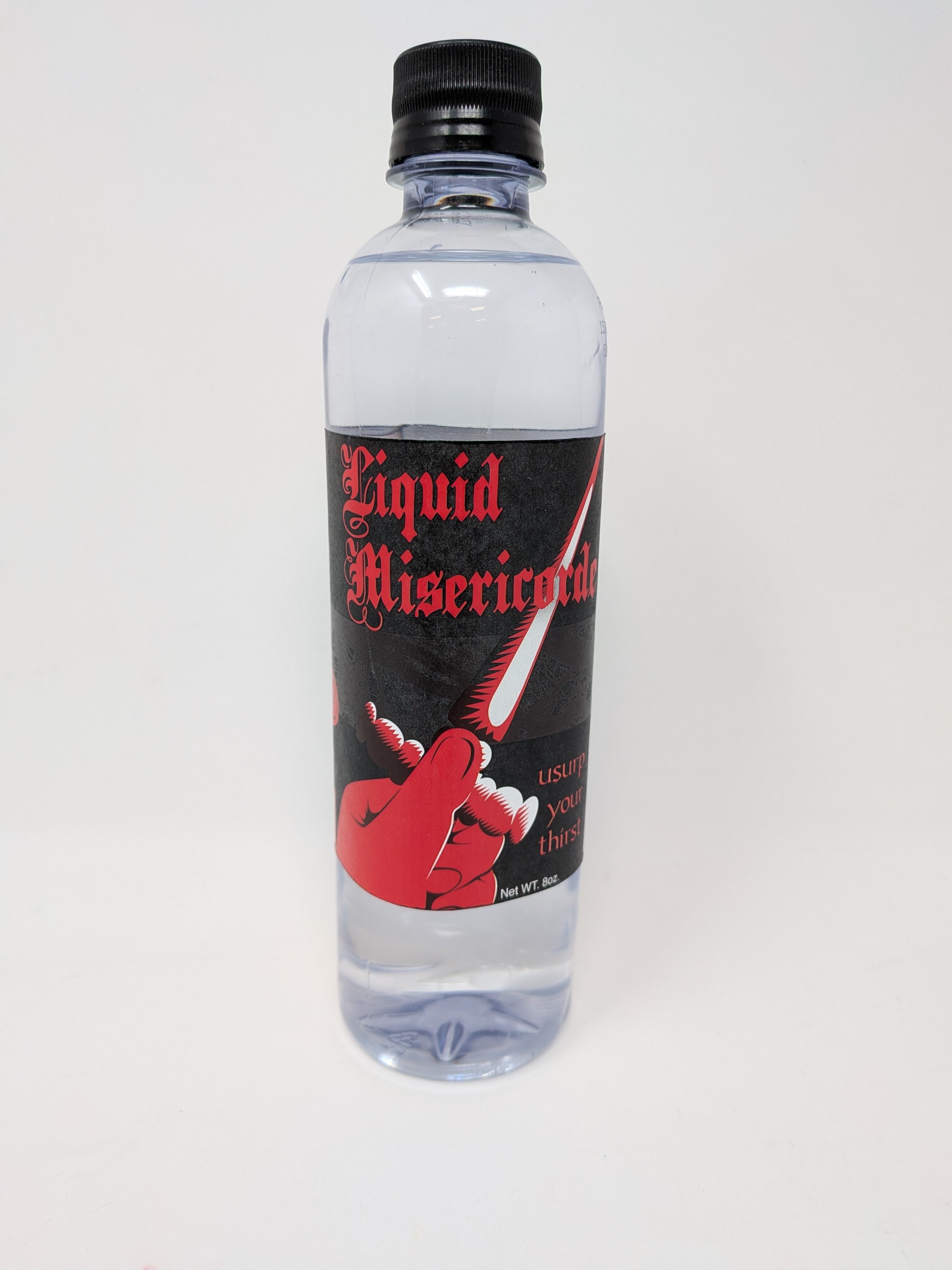
Liquid Misericorde
Printed design on paper, on found objects
This project was an assignment: Design a label for water, on provided a net.
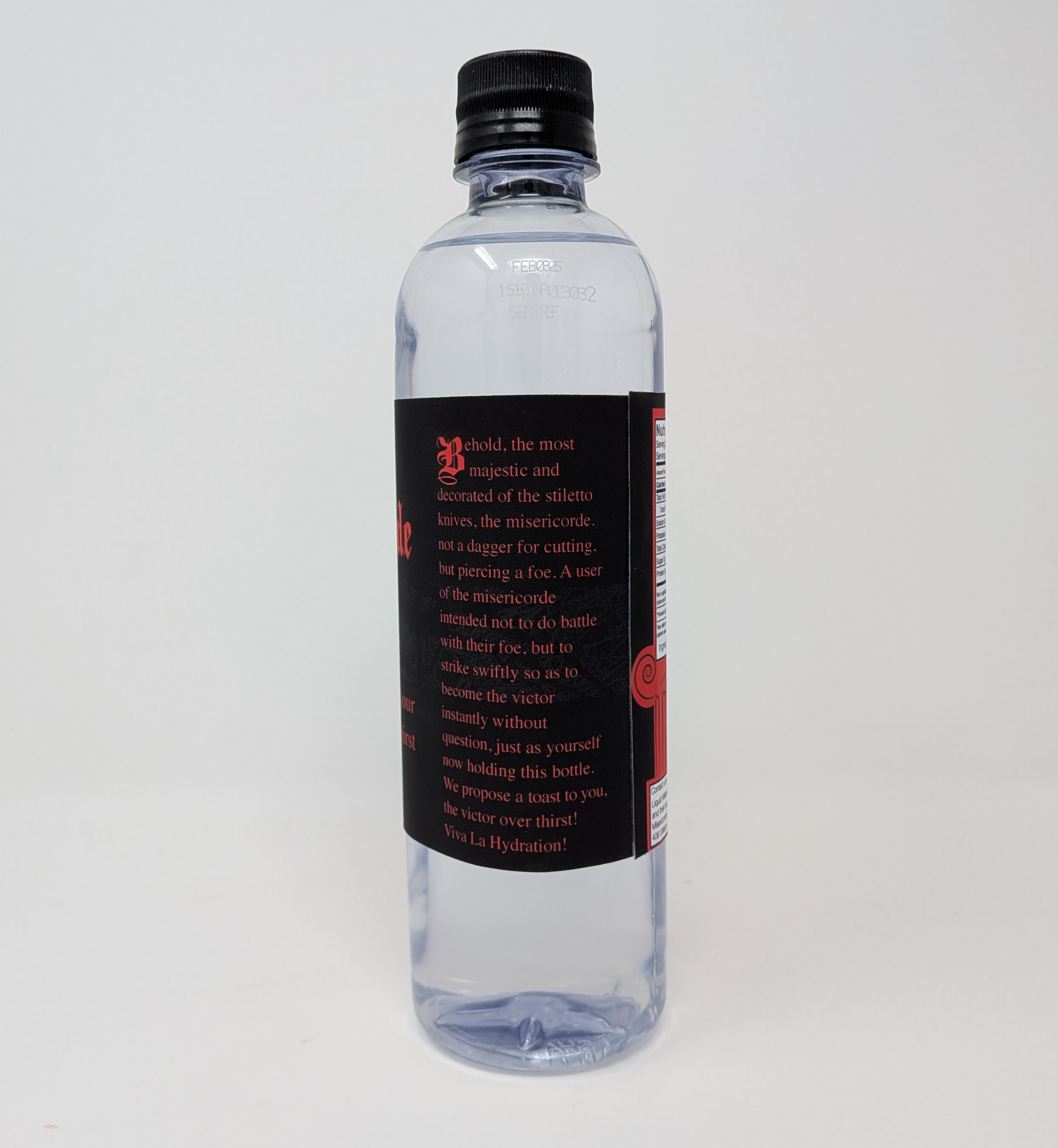
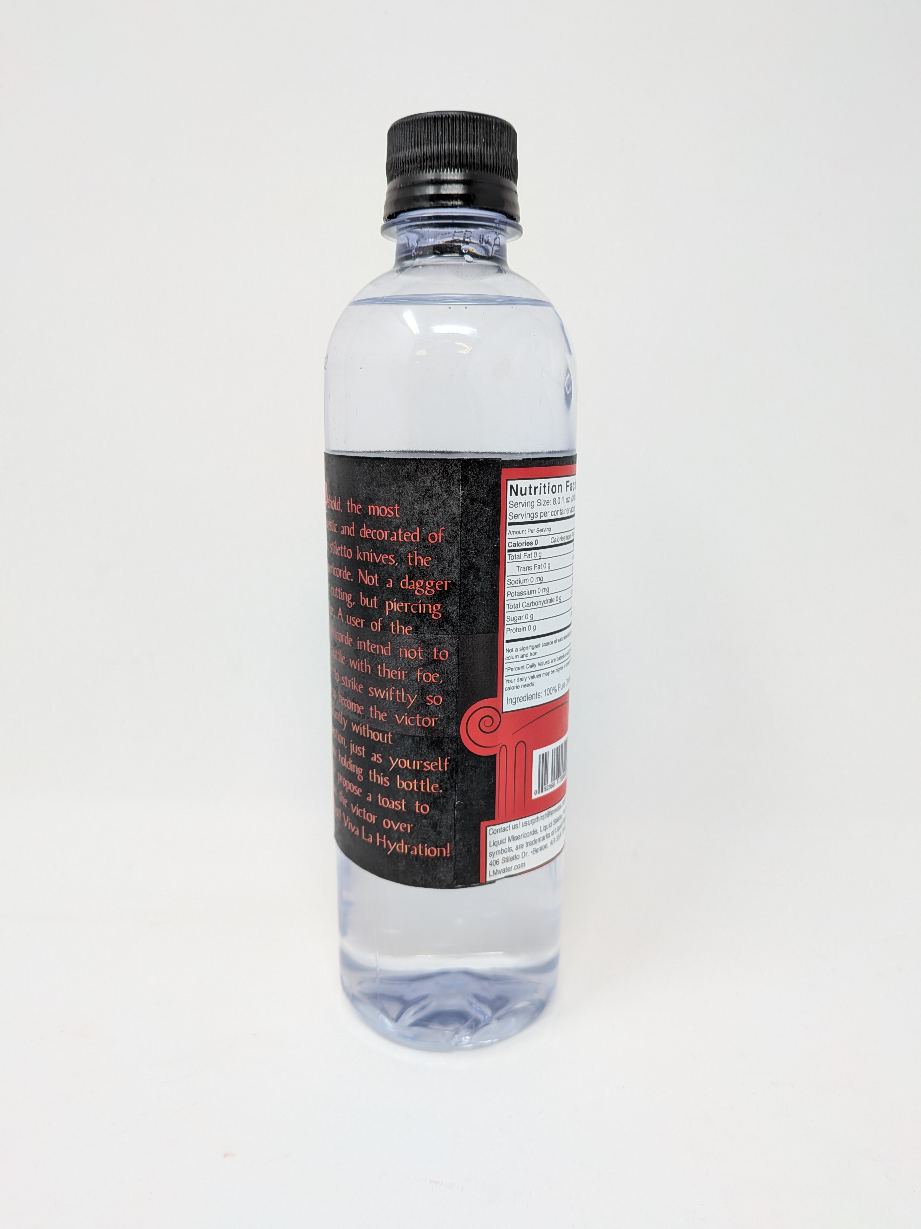
Inspired partially by the success of Liquid Death, this design targets members of the alternative scene. The idea of sharp objects in a bottle is no new gimmick, take Liquid Nails, caulk. The Misericorde was a weapon for self defense, assassination, and regicide. Counter to most knives and swords built for those purposes, this stiletto featured three blunt edges or two dull ones, both retaining the flat edge profile of a spike. This is because the implement was specialized for stabbing in brief, in a way that was hard to repair or recover from; death was certain for the person on the receiving end. The reason I go into such depth, is because my choice of knife for the brand/logo/illustration is dependent on its role and how it performs; this design suggests those qualities, but translated to thirst. The brand suggests certain doom and immediate, irreversible effectiveness for thirst. I would argue that, that is what anyone drinks water for. The fonts and other elements suggest revised, cultured, antiquity, anachronism in a good sense. The body copy on the side make the design and product's intentions extremely explicit for viewers, in a fun and relatable way.
In my revision of this work, I changed the illustration of the dagger, and used a different printer that was more accustomed to printing black.
See the details and the original version below.
How bored are you that you're reading my footer?